
Colour Control
What Happens to a Pantone Colour Once It Reaches Paper?
Choosing a Pantone colour creates a reassuring sense of certainty. There is a number, a physical reference and a shared language between the designer, client and printer. It seems reasonable to expect that once the colour has been selected, the printed result should simply look the same.
In reality, Pantone is a reference point, while printing is a physical process. The moment ink meets paper, the result is influenced by the printing technology, ink formulation, ink density and the way a particular colour behaves in production. This does not make colour unpredictable, but it does mean that achieving the right result requires more than entering the correct Pantone number.
At KOPA, we wanted to understand these differences better ourselves, so we tested a range of Pantone colours using LE-UV printing technology. Two ink systems were compared, printed samples were measured with a spectrophotometer and the same results were visually assessed by 14 people. The test showed that not every colour could achieve the same level of measurable similarity to the Pantone reference. It also revealed that the instrument and the human eye did not always judge the difference in the same way.
That distinction is important because the final product is not experienced through a ΔE value. It is seen as a whole: colour together with paper, images, binding materials and finishing.
The test also demonstrated how seemingly logical adjustments can produce unexpected results. Some special inks are relatively transparent, so an additional printing pass may be used to increase coverage or colour intensity. Yet with the neon colours included in our test, printing a second layer did not improve the match to the Pantone reference; one pass actually produced the closer result.
Examples like this are exactly why we prefer to remove uncertainty before the full production run rather than explain it afterwards.
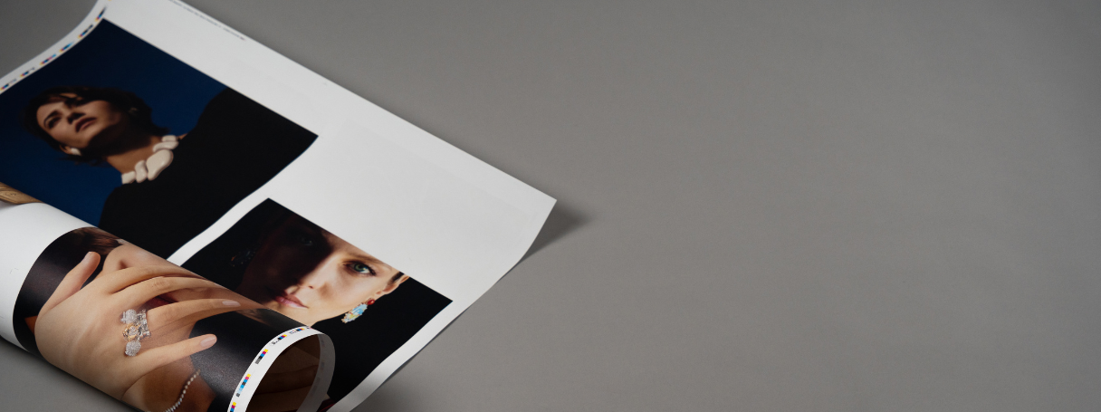
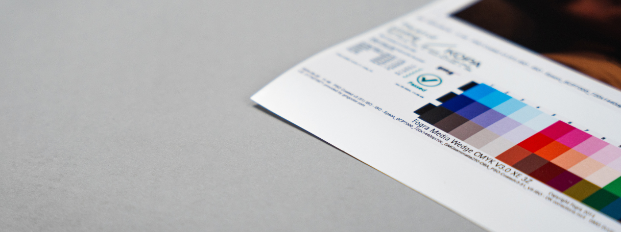
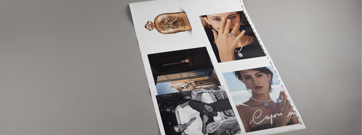
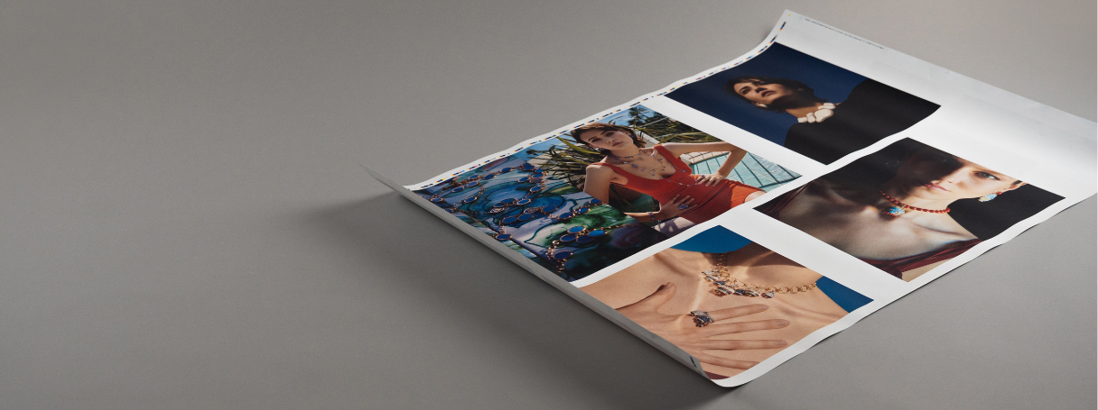
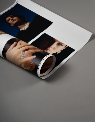
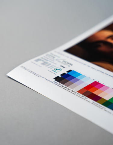
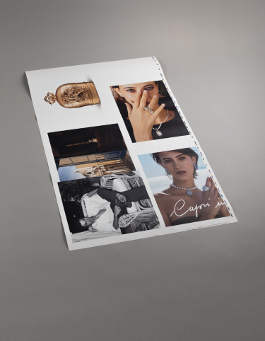
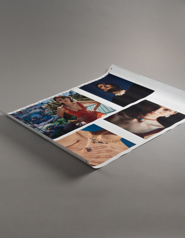
For colour-sensitive projects, one of the most useful tools is a wet proof: a physical test print made with real ink on the selected paper. It allows the actual colour to be evaluated before production and, just as importantly, compared with the other materials that will become part of the finished object.
If a cover colour needs to work with a cloth spine, a particular paper stock, printed endpapers or another already selected material, those elements can be placed together and judged as they will exist in reality. Instead of relying on a screen, a swatch or an assumption, everyone involved can look at the same physical result and make an informed decision.
For us, that is the real value of testing. The goal is not to make colour feel complicated, but to make the outcome more predictable. A Pantone reference gives the project a common starting point; a wet proof turns that reference into something tangible, giving both the client and the printer a clearer understanding of what the final result will actually look like.